In the world of graphic design, colours do more than just make things look pretty—they hold the power to influence emotions, shape perceptions, and drive action. The strategic use of colour in branding and design can evoke specific feelings in your audience, helping your business stand out and connect on a deeper level. In this blog, we’ll explore how different colours are tied to emotions and how you can leverage this in your own branding.
The Psychology Behind Colours
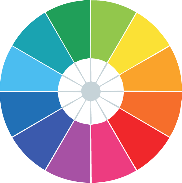
Each colour evokes a unique emotional response. Whether it’s the calming effect of blue, the passion conveyed by red, or the optimistic energy of yellow, these associations are essential when designing logos, websites, and marketing materials. Understanding the psychology behind colours allows you to tailor your brand identity in ways that resonate with your target audience.

Red signifies excitement, passion, and urgency. Brands looking to grab attention often use it.
Blue is associated with calm, trust, and reliability—ideal for finance or healthcare sectors.

Green evokes nature, health, and growth, often used by eco-friendly brands.
Yellow brings optimism, warmth, and friendliness, making it a great fit for light-hearted or energetic brands.
Purple suggests luxury, creativity, and wisdom, which is why it’s used in high-end and creative industries.
How to Use Colour in Your Branding
Choosing the right colour palette for your brand isn’t just about aesthetics—it’s about strategy. Every visual element, from your logo to website background and social media posts, should consistently reflect your chosen colours and evoke the desired emotional response.
- Logo Design: Your brand’s colour palette should be centred around the emotions you want your customers to feel. A vibrant and bold logo may resonate with an energetic audience, while softer tones might appeal to a more relaxed or professional crowd.
- Website Design: For digital platforms, ensure your primary and accent colours create the right mood for visitors. Are they inspired to learn more? Trust your services? Invest in your products? Your website’s colour scheme can steer those emotions.
- Social Media & Marketing: When creating content for Instagram, Facebook, or LinkedIn, stay true to your brand’s colour palette. Doing so will help build a cohesive and memorable brand identity.
Choosing a Palette for Success
Your colour palette should reflect your brand’s personality, mission, and audience. While each colour has a broad emotional effect, you must tailor combinations to create a palette that’s as unique as your business. For example, mixing blue with a bright yellow can communicate both reliability and creativity, while incorporating black into a palette with reds can add a sense of sophistication to excitement.
Colours are a powerful tool in graphic design and using them effectively can elevate your brand to new heights. Whether you’re launching a new website, creating a logo, or posting on social media, your choice of colour palette will directly affect how your audience perceives your brand. Take the time to understand how colours influence emotions, and let your design make an impact!
